Mockup of my beer league team's jersey imposed on my drawing from circa 1987
Top 25 NHL Jerseys of All Time
As part of their 100th anniversary, the NHL recently allowed fans to vote on the top 25 jerseys of all-time. Other than a few beefs (Why are the 'Hawks on there twice for basically the same jersey? Those old Kings jerseys were garbage, both of them.), I tend to agree with a lot of it. So good job fans, but I felt compelled to make my own Top 25 list anyway as hockey jerseys have always been one of my life's loves.
For as long as I've loved hockey, I loved the jerseys. Unlike baseball (kinda cool but let's face it, stray too far from the Yankees or Dodgers and it looks horrid), the NBA (not much real estate), or NFL (huge numbers) - there was a lot to work with. The huge crests, shoulder logos, stripes, colors, and even the fact they were left untucked. Back in the 1980s, I'd check out hockey books from the school library - not to read about teams or players, but so I could see pictures of hockey jerseys from years past or defunct WHA teams. I'd spend hours drawing (or tracing) logos and pictures (see above). Hey, it was a simpler time, we had to keep ourselves busy somehow. Having been a graphic designer for 20 years, I guess you could say it all started here. It's something I sill do today as I'm in the process of redesigning my beer league team's uniforms (see above).
So without further adieu, here's my highly opinionated, barely coded, sorta proofread, somewhat researched, and definitely definitive list of the top 25 NHL hockey jerseys of all time!
1) Blackhawks classic red jersey - as much as I've always hated the team, I've always loved their jerseys, they just scream hockey! The raw, unrefined, colorful, almost random Indian head logo on the sharp, straightforward jersey is just the best ever. It's so beautiful no one really decries the logo as being offensive like they do the Cleveland Indians or Washington Redskins. The C with the tomahawks on the shoulders is another perfect touch. I believe none of this is was intended, just all came together magically back in the '50s when they modernized their old "barber pole" jerseys.
2) Flyers 1970s orange jersey - perfect logo and the jersey always looked mean to me, so spot on for hockey. That orange is so aggressive!
3) Predators original navy - I remember the first time I saw the logo and was like "wow, that's better than anything I could have come up with." It's popular now to rip on any '90s era designs as being too busy or cheesy but the sabertooth tiger is a perfect hockey mascot and this is a fine jersey design. My biggest art dream job would be to merge this look with their current gold branding as they should have kept some silver and the modernized logo looks like an Adobe Illustrator disaster to me.
4) Nordiques blue - always loved the fleur-de-lis on the bottoms and still no team does anything like this. FOOTNOTE: first jersey I ever bought (still have it) and the initial inspiration for the Wampas jerseys I designed.
5) Red Wings red - perfect logo symbolism, jerseys are minimally awesome.
6) Maple Leafs blue from 1970-92 - I'm a sucker for arm stripes and has the best Leafs logo as it looks like a sporty version of the maple leaf on the Canadian flag, something they've lost by reverting back to one that looks like cross stitch from the 1800s.
7) Whalers green - Maybe the best sports logo of all time and such a unique look. I can remember seeing a picture of the Whalers in the old NHL Goal game-day program for the first time in 1985 but not knowing where Hartford was, so I thought it must be a town in far northern Canada known for whaling. My geography has only slightly improved since then.
8) Ducks eggplant from 1993-2006 - the perfect look for the team and the times, why they just don't revert back to these we'll never know.
9) Red Wings white - the only team that gets home/road jerseys included on my list. The whites were originally just inverted versions of the red jerseys until the red sleeves with the white stripes were added when numbers had to appear on the arms (for TV I think) and I've always loved how the shoulders curve into the sleeves.
10) Rangers classic blue - perfect hockey look. Often imitated, never duplicated. Their whites are also great, the shoulders have been ripped off 1,000 times too.
11) Sabres white from 1970-96 - a rare occasion where I like the white jerseys better and another all-time great hockey logo. Love the subtle red eyes on the buffalo in the logo. Also, ATTN: Sabres management: for the love of God, please revert back to royal blue and lose the numbers on the front, then never touch your jerseys again.
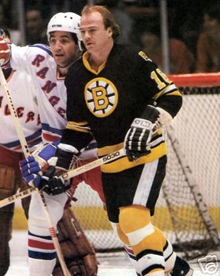
12) Bruins black from 1977-95 - raw, big, and bad like those teams. Like the gold B on the logo, best take on their classic look. PS - bring back the gold socks! #idiots
13) Devils red from 1983-92 - fantastic logo rendering and one of the rare instances where green and red didn't look like Christmas. Looked Italian to me so perfect for Jersey!
14) Canadiens classic white - funny as I've never been a big fan of their red ones but these are beauties.
15) Islanders classic blue - perfect logo, perfect look but just you wait for what's below...
16) Islanders navy "Fisherman" - most hated jersey by the fanbase in hockey history. Its problem isn't it's bad, its problem is it replaced a classic. Wearing this one as I type this, love it!
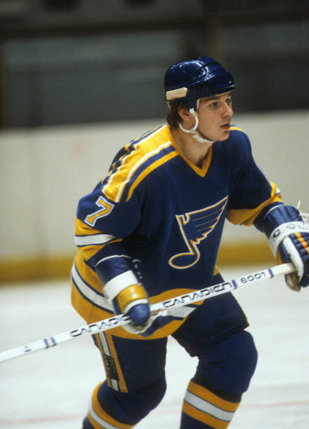
17) Blues blue from 1979-84 - again hate the team/city/fans but love the logo and this is the best take on their jerseys (current look must have been based on this and is a close second, love the two-tone blue).
18) Oilers blue from 1979-96 - no Gretzky and the Oilers probably move to Houston in 1986 and this jersey doesn't make my list, but The Great One made this a great look.
19) Kings 1996 "Burger King" - I have one and it's one of my most prized possessions. The problem wasn't its design as much as its execution. Purple beard? The diagonal stripe works for hockey and a team should try this again. I should Photoshop this in black... oh imagine the possibilities! I wish NHL teams would take more risks like this.
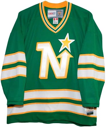
20) North Stars green from 1975-78 - near perfect logo, love the green with the gold and this was the best take on their jerseys (could have used some shoulder patches).
21) Canucks gold from 1978-85 - so ugly it's a modern art masterpiece... seriously. The fact these ever got made, even in the '70s, still amazes me. If memory serves, the team reached out to an agency and they came up with the gold/orange/black color scheme to look aggressive and the large V which supposedly stood for victory and not Vancouver. Not sure if that struck fear into the hearts of their opponents exactly but nothing if not bold thus worthy of inclusion on my list. I have the later version of this jersey with the Canucks Star Wars logo and I love wearing it out as it's so obnoxious. Looks like a Taco Bell exploded all over you.
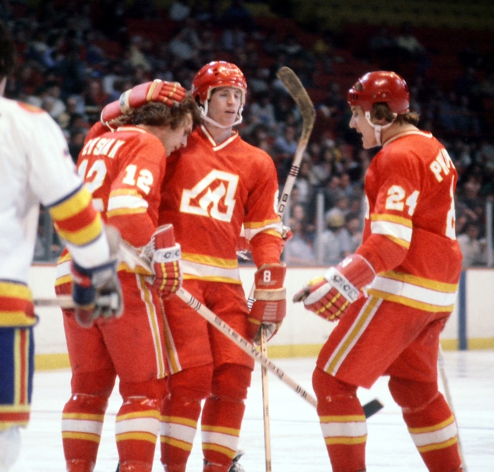
22) Flames red from 1972-80 - another great logo, jerseys fit the team. I hope someday the Canadian Parliament bans Calgary from using black on their jerseys from now until eternity plus 100 years.
23) Rockies blue - Rocky mountain high, can't say these don't scream Colorado. Way better than anything the Avalanche have come up with.
24) Stars green from 1997-06 - the logo was just OK but the huge star pattern on the jersey looked great, also a better shade of green than they use now.
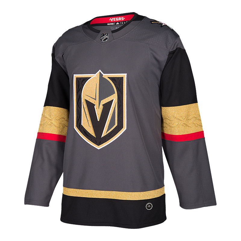
25) Knights gray - Why not? Red looks barfy and outta place but pretty good take on a jersey for this day and age where everyone wants to look like the original six teams instead of having fun and forging their own identities.
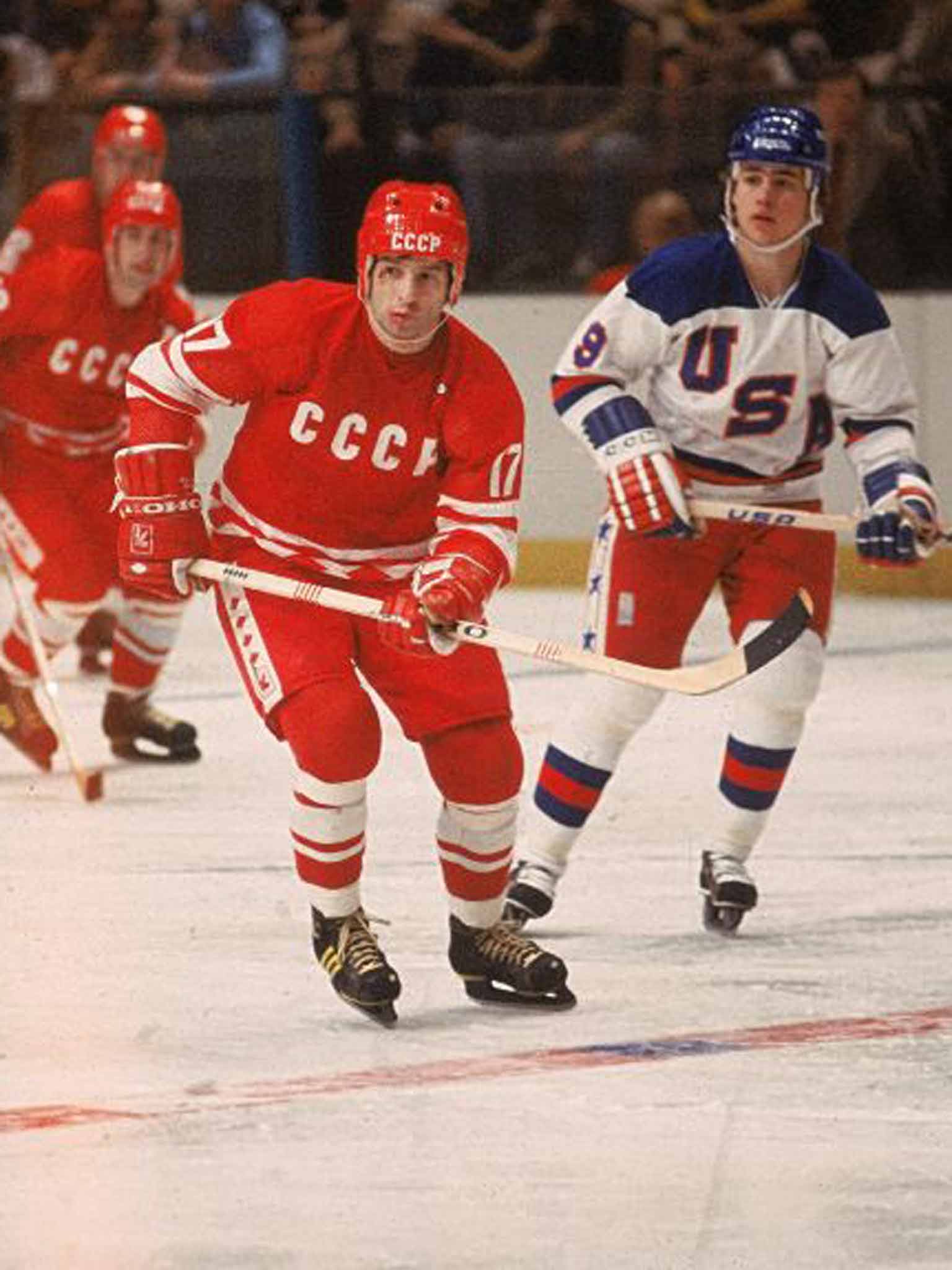
OVERTIME: Soviet National Team - So stark and menacing! Put these jerseys on Team France and probably not so scary, but something about the Cold War and seeing CCCP on the front meant you were about to get to get a beat down (except for one glorious moment in 1980).
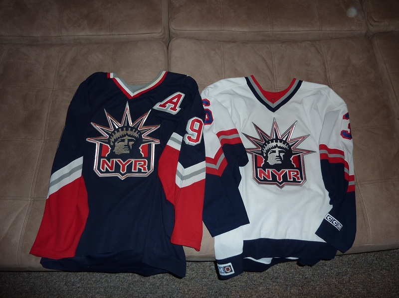
DOUBLE OT: MY FAVORITE THIRD JERSEY THAT I PROLLY SHOULD HAVE LISTED - Rangers Lady Liberty jerseys were outstanding, one of the favorites in my collection. The only problem with these is they just can't replace their classic look.
TRIPLE OT: NHL teams that look OKish - Wild (great logo, dull unis), Panthers (decent but needs more Florida), Capitals (eh close but never quite nailed it), and Jets (new logo sucks, if you saw this uninitiated you'd think it was the Ottawa Maple Fighters)
QUADROUPLE OT: NHL teams that have always looked like crap - Coyotes (great name with never a good look), Hurricanes (toilet bowl), Avalanche (logo looks like Ocean Spray juice), Blue Jackets (more like Butt Cheeks - the canon logo is a step in the right direction), Senators (just start over again), Penguins (honestly people, the logo is cartoony and corny), Sharks (best name in sports but never liked their look), and Lightning (again great name, lame branding). If any of these teams would like to approach me about rebranding, I'm available anytime!!!
ALL IMAGES ARE THE COPYRIGHTS OF THEIR RESPECTIVE OWNERS AND USED WITHOUT PERMISSION FOR EDITORIAL PURPOSES ONLY.


0 Comments:
Post a Comment
Subscribe to Post Comments [Atom]
<< Home